
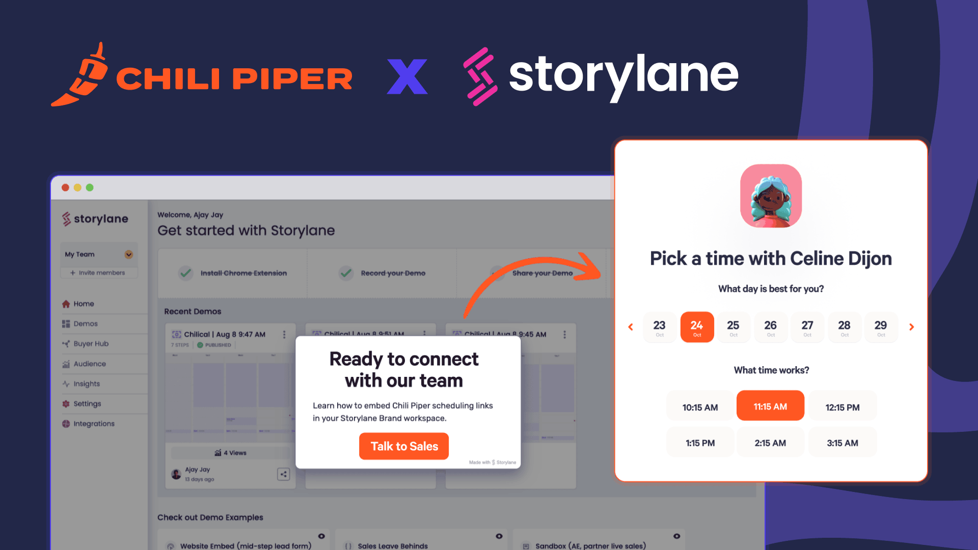
3 Surefire Tactics to Increase Your Form Conversion Rate
April 24, 2023 min to read

“My conversion rates are already good enough,” the prospect said. “It’s impossible to increase the conversion rate on my forms. Your customers must not optimize their pages very well.”
I was listening in on a sales call, and I couldn’t help but shake my head.
Unfortunately, we hear this all the time.
The thing is, if you Google “how to increase form conversion rates,” you’ll find loads of articles filled with unremarkable and generic tactics. Articles designed to rank instead of help.
Forget about quick hacks and best practices. That’ll only get you so far.
In this article, we dispel myths about form conversion optimization, interview experts, and give you a three-step plan to help you improve double your form conversion rate.
Let’s roll.
1. Keep form fields at a minimum and leverage lead enrichment tools
The consensus among marketers is that short forms convert better. It makes sense. Fewer fields = less friction = more conversions.
Spoiler alert, it’s not that simple.
Here’s a poll I ran on LinkedIn as part of my research:

Fewer fields win by a mile.
But, on the other hand, there seems to be a tradeoff. Longer forms convert less but result in higher quality leads.
I spoke with Ryan Greives, VP of Brand & Communications at Formstack, and he agreed.
“There’s a chance you can improve conversion with fewer fields, but you also might decrease your quality. For example, we recently added another field that asks about company size to help route to BDRs for discovery calls and saw a significant increase in quality and better lead routing.”
The rationale behind long forms is twofold:
- The friction “disqualifies” leads who aren’t as invested
- The fields themselves add insights that help qualify and route the lead within your sales team
Dr. Fio Dosetto, Editorial Lead at Wildbit (and one of my favorite content marketers), had an interesting take. They’ve actually added more fields to add more friction and “disqualify” the wrong fit at the start of a product sign-up process.

I've heard this several times. I don't think it's an unusual approach. But, what I think it’s doing is creating unnecessary friction for your best leads.
When you’re thinking about your highest quality visitors, you want to build an optimal experience from beginning to end. And if you're not doing that, you're losing people in the process.
I understand the impulse to add more fields to “disqualify” the wrong fit, but it's misguided.
So, what’s the better tradeoff?
Short forms with more conversions?
Or longer forms with fewer conversions but “better-fit” leads and more data?
Neither. There’s a better way.
Leverage lead enrichment tools.
You can create dynamic forms that keep fields at a minimum while still collecting all the information you need from your leads.
For example, at Chili Piper, we only ask for a business email and two questions on our demo form.
Then, we have Clearbit enrich everything else, like company size, industry, and any other firmographic or demographic attribute we need.

We can collect everything we need and keep our forms nice and tight.
It’s the best of both worlds.
The team at Gong also uses Clearbit + Chili Piper to replace a once manual (not to mention slow and ineffective) SDR process.
The image below is what their self-scheduled demo request flow looks like today:

Acquiring automatically enriched data enabled their team to instantly qualify leads and provide self-serve demo-scheduling to fast-track the best leads, thanks to automation built with Chili Piper.
The result: A 70% lift in form conversions and a 5x increase in the number of demo requests.
"We figured out how to instantly qualify and route a lead without sacrificing engagement. This was a game-changer," said Director of Marketing Automation Noa Farber.
TravelBank is another great example.
According to Curt Smith, Head of Demand Generation at TravelBank, they used to have eight to nine fields in their forms.
“When somebody would come to request a demo, I would watch those screen recordings and heat maps. We had so many abandonments where people wouldn’t fill the forms out all the way, and they’d just be like…Okay, I’m done with this.”
Since Curt implemented both Chili Piper and Clearbit, form completions have increased by 2-3x, and their number of qualified meetings booked increased by 40%.
It truly is a win-win.
People get simpler forms to fill out. You get more data and increased form submissions.
In fact, as I was conducting my research, I took a look at Unbounce — one of the most popular drag-and-drop landing page builders.
Unbounce has, what they call, “the most comprehensive (free) landing page analysis tool ever.”
I decided to play around with it, using Chili Piper as an example, to see what they had to say about forms and form fields.

The tool doesn’t pick up on the fact that we use lead enrichment (it says we have 14 fields). But I was still pleased to find Unbounce’s research also concludes that fewer fields mean higher conversion rates.
To dive deeper into other research, I sat down with Nick Wentz, Head of Marketing at Tango.

The findings were impressive.
One stat that stood out to me is that conversion improves by three to five percent for every additional form field removed.
Formstack, the form solution provider, analyzed over 650,000 forms users and found forms have an average of 11 fields.
E-lev-en.
I can’t help but imagine three to five percentage points immediately knocked down with every one of those (unnecessary) fields. It’s absurd.
Two of Clearbit’s most popular clients, Livestorm and Gong, both reduced their fields from seven down to just one and saw an increase in form conversions by 50% and 70%, respectively.
Nick also mentioned they’ve seen dynamic forms increase conversion rates by as much as 160%.
So, by all means, reduce your form fields and let lead enrichment tools do the heavy lifting.
Pro tip: Use the extra room to add qualification criteria questions. It’ll make the initial meeting more effective or allow you to point the prospect to a different resource if they aren’t the right fit for sales.
2. Add a booking option to your forms
Adding a web form scheduler like Form Concierge to your bottom-of-funnel forms — contact, request pricing, or demo — is the most effective way to double your inbound leads with zero additional effort.
Think about it.
You’ve already done the hard work of getting prospects to your site. They’re raising their hand and looking for more of your product.
Don’t shoot yourself in the foot by making them jump through hoops.
Make it easy for prospects to schedule a meeting immediately upon completing your form. That’s what they’re there for anyway. To talk to someone. Let them.
Here’s how that looks.

Once a prospect submits a request, Form Concierge automatically qualifies the lead, routes them to the correct salesperson, and displays a simple self-scheduler so they can instantly book a time — all in a matter of seconds.
There’s no wait time, no thank you page, and no waiting for an inbound SDR to reach out.
It happens instantly. Right when prospects are most engaged on your site. Completely redesigned for the modern customer experience.
To understand more about how this works in real life, I sat down to chat with a few industry leaders. Here are three key takeaways of why you should add a booking option.
Your business is about helping your customers. So help them.
I sat down with Carmen Cedeño, Director of Demand Gen at Alma — an organization on a mission to make it easy to find high-quality, affordable mental health care.
I asked her what made Alma want to adjust the “status quo” and add a booking option to their forms.
“Adjusting the ‘status quo’ came from the idea that our north star is not a quota or a revenue target — it’s to help people.”
Those words hit super close to home. Help is our #1 core value at Chili Piper.
“Many startups scale their growth and marketing tactics around internal quotas (MQLs, pipeline, meetings)... and it doesn’t put customers (who are human!) at the heart of the buyer’s journey. Chili Piper helps us do that!”
But, how does this affect conversion rates?
“Concierge has allowed us to increase our [form] conversion rates, meaning that we’ve seen a positive trend in winning more deals by removing friction, increasing speed to lead, and making it easier for prospects to decide if they want to join Alma by providing them with all the information they need prior to booking a call.”
Hearing that made me really happy — it’s exactly what we designed Form Concierge to do.
Constant improvement is a virtue. And a business necessity.
I was also fortunate enough to talk to Johnathan Warren, Director of Revenue Operations at CaptivateIQ.
I specifically asked him about a common objection we hear: “My conversion rates are already good enough; why waste time on adding a new tool?”
“Show me an Ops person that thinks their conversion rates are ‘good enough,’ and I'll show you a problem with their data,” Jonathan said.
He’s not wrong. Constant improvement is a virtue.

“While the cost/benefit analysis needs to make sense for your team, implementing Concierge can have quick and meaningful impacts for your business.”
Looks like we nailed that one on the head.
Listen to the numbers
Tim Davidson, Senior Director of Digital Marketing at Directive Consulting, also shared how adding a booking option to their forms increased conversion and revamped their sales process.
“They fill out the form, and then right on that ‘thank you’ message, they see a scheduling link for Chili Piper, and they can book a call.”
“It’s increased our intro calls held, so it’s obviously huge at scale,” said Tim.
Before Chili Piper, their conversion rate was sitting at 31%. Now, that’s increased to 52%.
I’m not great at math, but my calculator says that’s a 68% increase in Directive’s form conversion rate.
That’s huge.
We’ve seen this tactic, adding a booking option, consistently help businesses (more than) double their inbound leads and give sales teams more opportunities for conversion.
See what Form Concierge would look like on your site. Get a preview.
Pro tip: For prospects that aren’t a good fit, route them to watch a recorded demo or sign up for your free product.
Hilarious bonus: Can you imagine if B2B had restaurants? This video from Tim himself is pure gold.
3. Add supporting text in and around your form
Supporting text in and around your form reinforces your most important benefits without making it seem too complicated for anyone to sign up.
Remember the first time you heard about Netflix?
The streaming service seemed almost too good to be true, with unlimited movies and TV shows for less than $10 a month.
What a killer value proposition… it’s no wonder they put the competition out of business. RIP, Blockbuster.

Apply the same strategy to your own forms and landing pages.
You don’t have to include a considerable amount of detail — just a line or three is enough to help keep prospects focused on why they’re bothering to fill out your form in the first place.
Here’s what that looks like for monday.com.

The biggest fear and resistance we all have is getting spam emails. And in the case of trial forms, we tend to assume we’ll have to enter our credit card information — so we often avoid taking the trial overall.
Acknowledging that fear with supporting text is pivotal. Monday.com uses its subheadline to emphasize the fact that it’s free and they won’t ask for your credit card.
They also lean on social proof by highlighting that over 152,000 teams use their software and include logos for some of the most high-profile companies.
We’re seeing similar results with our own demo landing page.
Our Growth Manager, Batikan Erdogan, has been tweaking the supporting text in and around our form and running A/B tests.
Here’s what the original landing page looked like versus the variant.

Our Sr. Demand Gen Manager, Tara, had already added a new section to the page with “Recent customer wins” (bullet points with real stats from customers) and saw a 10% increase.
What Batikan did was:
- Moved the wins higher up above the fold
- Bolded important stats
- Reduced the phrasing in the headline
- Eliminated the navigational bar
The result: A 55% increase in conversion rate. I’d never seen such significant results from an A/B test.
The takeaway: As you optimize your forms, be mindful of all the supporting elements.
Make your offer clear and compelling, support your value props with numeric values, and place your data up front where it’s easy to digest.
Social proof pro tip: Descript combines multiple tweets into one quote and then links to a Twitter “collection” of compliments from users. Visit their homepage and check it out (scroll down a little when you get there).
The bottom line
One quote stuck with me after speaking with Jonathan Warren, Sr. Director of Revenue Operations at Spiff.
“Until you’re converting 100%, there’s always room for improvement.”
He’s exactly right.
The problem is, most of the information out there is plagued with your classic run-of-the-mill tactics. It’s hard to find something meaningful that can drive impactful results, especially for B2B website conversions.
Not anymore.
Implement the three tactics above, and I can guarantee you’ll see a significant increase in form conversion rates.
If you’d like to learn more about Concierge, go ahead and book a demo. We’d love to talk to you.
See the power of Chili Piper in action today!
Carlos Silva is an SEO Content Manager at Chili Piper. He's passionate about the craft of writing and the power of storytelling. You might find him trail running through the mountains of Valencia, Spain, or writing in his journal at home, but you'll always find him reading something new!


marketers!
No spam, just spice

